3 Common Misunderstandings About Print

As printmakers, we Zartists have to deal with a lot of old-school presumptions about the art of printmaking. The three most prevailing misconceptions regard its status as a ‘copy’, the notion ‘authenticity’ and its ‘value’. Hello art world! It is time to dust of ideas from before the turn of the century and start to rethink the status of print and printmaking. We will raise a few questions here rather than we can provide full answers. The three big But(t)s we often deal with are:

1.”But it ‘s a copy!”

False: it is a remake

To speak of copying is so last century. Copying is dead. Copying is something you do online when you grab a picture someone posted and add a comment to look smart. We prefer to speak of remakes. Why do we refuse to speak of copies? To start with, it is truly an art to make a good print. It is not exactly the case that you can put a painting under a photocopier and expect a good print. Of course a print is a remake of a work and concept that already existed, that can’t be denied. Zart recycles a concept of an existing work and transforms it into a new ‘product’. But you can hardly call it an exact copy. In the words of Zart photographer Bram Kloos: “ Making a print is an art in itself. It is quite difficult to make a photograph of a work and translate it into an exact same image. I do not see why anyone would think of a print as a lesser product. It is a different product. Of course, you are highly indebted to the creator of the original idea when you use a work as a basis, but the prints appear in a completely different form. The material is very different. I fail to see why that is something bad”. Zart couldn’t agree more.

2015 Zart 3 misunderstandings about print infographic

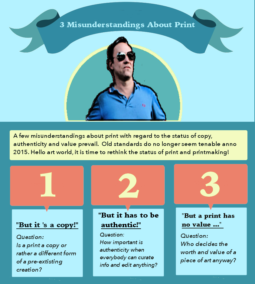
2.”But it has to be authentic!”

A Print is not the same as forgery

In art, buyers want a work to be authentic because being real defines the price and cultural value a work. Authenticity is not one thing. Most of the time people refer to the origin of authorship, though. Who made the work and how do you know it is not a forgery? Printmaking is often associated with forgery. Zart makes its prints in co-authorship with the artist who created a concept, an installation, a virtual work a graphic or a painting. Since we work with living artists we have the opportunity to request a certificate of authenticity. The certificate carries the original signature of the maker.  That way there can never be any misunderstandings about the origin of the works. The works appear in limited editions only. The prints are signed and numbered. What is not real about that? Let’s not confuse a print with a forgery please!

3.”But a print has no value …”

Time will tell

As no one can tell for sure which artist will be of ‘worth’ – money wise, buying art as an investment for your great grandchildren is not a good reason to purchase anything. As art pope Charles Saatchi states in an interview to a journalist of the Guardian when asked what artists will write history: “ General art books dated 2105 will be as brutal about editing the late 20th century as they are about almost all other centuries. Every artist other than Jackson Pollock, Andy Warhol, Donald Judd and Damien Hirst will be a footnote.” So if you are interested in art, you might as well choose a work that suits your taste and wallet. From this perspective, there is a lot to say for a print. Only time will tell who will be classic. In the meantime, Zart thinks it is best to let Zartians decide for themselves what artist is hot or not.

Call for entries

Bloggers pay attention

A million more things can be said about print and copying, value and authenticity. Do you agree? Do you think our line of argumentation is off the wall?? Are you a blogger or a writer who has something to say about print & printmaking on a slightly theoretical level? Do not hesitate to offer us your contribution! Send us your article. We will be happy to take your work into consideration for publication on our blog. Articles can be sent to info@zart.nu .

Why Do We Multiply?

Everyone knows what a Platypus looks like, can envision the rings of Saturn, imagine a blue whale, ‘knows’ how lava flows, or even search for an X-ray scan of a Masai warrior’s chest. From the cradle to the grave we are bombed with visual input. With each image that rushes into our world our concept of the world grows. There is practically nothing we did not see before. Nothing we can not imagine. What can be known is shared. Even in real time. We obviously have a desire to pass on what we see and hear, a need for news, a passion to multiply.

Life is Sharing by A. Levine. shared by cogdogblog

Life is Sharing by A. Levine. Source: Flickr Creative Commons Licenced (BY-SA)

Sharing culture

It looks like the image has gained power over the written word with the rise of the internet. Where we used to read articles we now prefer an info graph. A good press picture is as powerful as a journalistic report. Why do we prefer images over text these days? One explanation is that an image is easier to share. It is more practical as a way of communicating with the world. When we see or hear something new we want to share this fact with our friends or who ever wants to listen. Visual information simply takes less processing time and is easily absorbed in the midst of the information overload. It is easier to digest. Thanks to modern distribution techniques sharing never was easier. An image can be multiplied by pressing a button.

Power to the image

The steady growth of the power of the image did not happen overnight. Visual culture experienced several revolutions. There seems to be a relation between the desire for news and the art of printing. More specific, we are referring to the art of multiplying. People set out by manually copying on a small-industrial scale. Then there was the invention of printmaking like engraving woodcuts, lithography, followed by working with rotary presses, photography, film and motion picture, television, the digital image, and finally the ubiquitous ability to create images and immediately share them with the whole world through the internet. Apart form all kind of psychological aspects, one of the main reasons we share our images with the world because we can. Because we have the techniques.

mage from page 14 of "A short history of the printing press and of the improvements in printing machinery from the time of Gutenberg up to the present day"

image from page 14 of “A short history of the printing press and of the improvements in printing machinery from the time of Gutenberg up to the present day”. Source: Flickr creative commons

News

In the past, let’s say in the Middle Ages, images were rare. A man knew the faces of his fellow villagers, the local landscape with its buildings and animals in it. The only variation on the images of the familiar surroundings formed the predictable change of the seasons. Maybe he saw a stained glass window in the local church, a painting or fresco, a pair of saints or a tapestry. New visual input was rare. News in general was an extraordinary thing. News usually came in the form of spoken word, storytelling, songs and gossip. Nowadays we consider visuals also as news.  Visually, news could be a new face to watch, perhaps a strange pair of trousers or unknown keel or cap to stare at, and stories from behind the horizon to listen to.

Hunger for news

One can imagine that the hunger for visual input due to lack of outside impulses led to intense studies of things and creatures that were available in the direct surroundings. The average person in the Middle Ages may have known in detail all trees, plants, animals and people in his habitat. Botanists and travellers drew in detail what they saw. Most imagery was religious or scientific by origin. It did not take long before popular images were reproduced by copyists in monasteries and studios. By hand. This changed radically with the invention of the printing press in the 14th century. Pamphlets, prints and illustrated books spread over Europe. With the books and illustrations a world of ideas also spread. Like in today’s FB updates, people wanted to share their view on the world.

So we share our images with the world because we have the technique. Thanks to modern distribution techniques sharing never was easier. The techniques are constantly renewed but the need to share news and things that surprise us or emotionally hit us, remains the same. Did anything really change?  


Joep Zijp

Joep Zijp

Every now and then Zart invites a guest writer to say something about art, printmaking, graphic design or photography. This week we are highly indebted by by Joep Zijp for his contribution. Joep whas journalist and editor  for several media and worked for publishing house Sanoma among others.

Pochemuchka design: collage art as integrated design

All things change and we change with them. This is the leading idea behind the collages for Zart by Esther Vreeland, aka Pochemuchka Design. Pochemuchka Design is best known for her collage art. Vreeland is not too fond of the label ‘artist’ but would rather be seen as a designer. Together with Zart she also started to produce what could be called integrated design concepts. Integrated design is a term borrowed from architecture referring to a collaborative designing method that requires multidisciplinary teamwork. From beginning to the end, all stakeholders are involved in the design process. Vreeland is a master in remixing all kind of elements into one total design. The product, formerly know as artwork, can be a large visual or a room. In the end, it is the juxtaposition of smaller design elements that tell a story, make up a collage.2014 zart esther vreeland

Catchy Sketchy Style
Is there a Pochemuchka style? ”I do not have one way of working”, Vreeland says,”although I do have to admit that I often use simple cut and paste techniques. I take cut outs from drawings. Somehow that feels a bit mysterious because you do not know in advance what story will come out in the end. What remains to see after the cut out process is just one isolated part of the original image. If you assemble all pieces into one new work, it resembles a sketch. Vreeland reaches a sketchy effect or ‘look and feel’ if you want, by adding (hand) drawn elements to the collage”.

Visual dj-ing
Vreeland’s collages work might best be seen as a remix of little stories. Like a DJ mixes records into new tunes, Vreeland mixes visuals. She singles out a story line, cuts it up and remixes it into a new form, a new scene. Being born and raised in Amsterdam Vreeland saw some big transformations. The process of change is one of growth and decay, of construction and deconstruction. Vreeland:”I was born in the Runstraat. One of the Nine Streets and have seen the city transform. When I used to live there, it was a working-class street. There were a grocery and a druggist and we had the milkman downstairs. Many people still used coals. Now the Runstraat is one of the Nine Streets. The grocery is is some posh beauty parlor. Everything has changed, of course. If you look at our constant changing world as a story, it becomes a tale of continuously constructing and deconstructing all kind of things. Many things happen all the time and these events leave their traces.”
elevation montage 1 imgur_Collage
Vreeland picks up traces everywhere. Elevation Montage is full of such traces. “Sometimes I peek through a window and I wonder what is happening inside” Vreeland starts to explain the origins of this work. “And so many things happen. Behind every door and window a story unfolds. There is a scene everywhere. A city is a place of coming and going of people. It has a history of many things happening. Now and in the past. I used to live I a house where someone hanged himself. One of my friends was scared to come and see me there because of what happened. I felt that was nonsense because good and bad things have happened everywhere all the time, for centuries”.

DIY adventures
“Every window tells a story. I wanted to breathe life into all the little houses, so there would be a small face everywhere”, Vreeland continues. Since one can’t go around and take pictures of people in their homes, Vreeland just looks for pictures on the internet that somehow grab her attention. “Like this man’s letter” she says while she points at the small image in the top left corner of Elevation montage. “Who is that man? You can look at it and make up a story. This gives me a feeling of adventure and traveling without GPS. As if anything can happen. If you would place all the small images in another context, you will get a completely different story ”.

A Panorama for the Zuiderbad
To Vreeland collage is the art of remixing daily life. Because there is so much choice –take a look out of the window- it is difficult to limit oneself. It is not a secret Vreeland prefers to make commissioned work.“I like a clear starting point”, she tells. In the image below is a work specially made for the Zuiderbad, the swimming pool situated next to the Museumplein. In it you can see how images and important places like the Rijksmuseum and the fire brigade, images from the past and present relevant context collide into an enormous panorama of 60x 1.80.
Zuiderbad Original kleineri]
Red bricks and tourists
“The only guiding principle for creating this panorama, was the client’s idea about what should be in the image. The Zuiderbad wanted a large visual of the front of the building. So that is where I started. In front of the building”. Vreeland worked together with illustrator Steve Dumayne. “I usually work with preliminary study. Steve had the idea to go to the Museum square and to take pictures of things that happen on the square and the general surrounding”, Vreeland says about the working process. “
referentie - kopie
The Zuiderbad lies in one of the most touristic areas of Amsterdam so we had to get some tourist in, that was inevitable. But the old gangster car happened to be there as well”. When Vreeland and Dumayne started with their mood board, the first thing that jumped to the eye was the colour red. “If you sit down in the area you will see that all buildings are built with the same type of red stones”, Vreeland continues. On the corner is the fire brigade with its red cars as well. The red bricks form the unifying factor in the panorama”. Historical context “In our first draft”, Vreeland says, “we added some traces of history and superheroes to stress the importance of the surrounding buildings. The building on the right used to be the Velox cycling school. This is where people used to learn how to cycle. Now it is called the Veiligheidsgebouw, the House for Safety and Security”. In our first sketch, I put superheroes behind the windows to reach a sort of vigilante effect. This idea was rejected, unfortunately. So I replaced the superheroes for figures from Rembrandt’s Nachtwacht and this way kept the spirit of the Veiligheidsgebouw and at the same time linked it to the Rijksmuseum.”

Book us
You can book us for redesigning your place, hotel, lobby reception or a custom made large visual
through the contact form. See work by Pochemuchka design https://www.zart.nu/portfolio/esther-vreeland/

Schermafbeelding 2014-11-06 om 12_Fotor_Collage