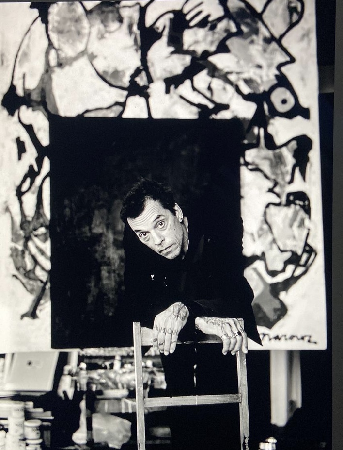
Een vriendelijke herinnering Narouz Moltzer’s 60e Verjaardagsexpositie!
Dag Zartanen en kunstliefhebbers,
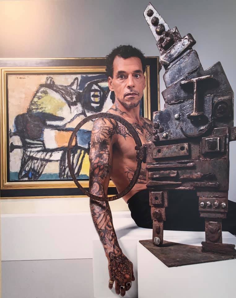
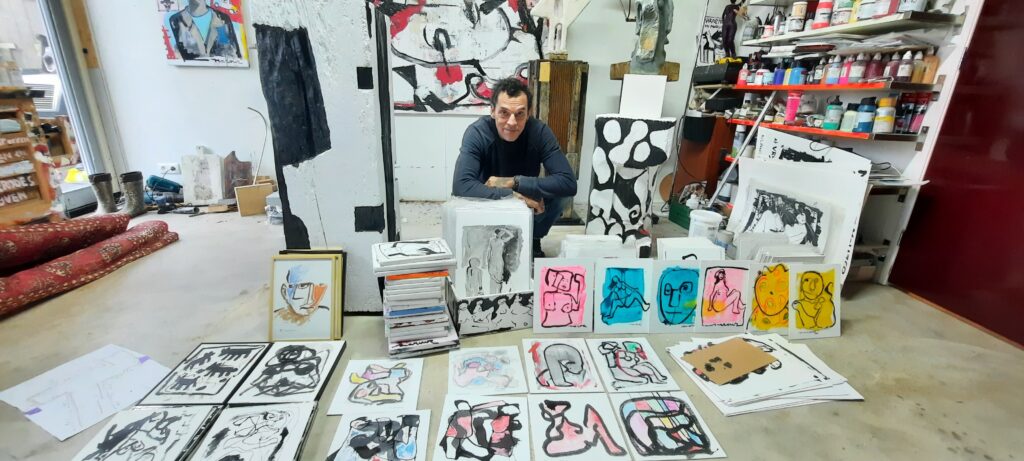
Stel je voor: een ruimte gevuld met schilderijen, sculpturen en andere kunstwerken van Narouz Moltzer. Dit is precies wat je te wachten staat op de solo expositie ter ere van zijn 60e verjaardag. De expositie wordt gehouden van 22 tot 24 december in het “Vrij Paleis” op Paleisstraat 107, 1012 ZL Amsterdam
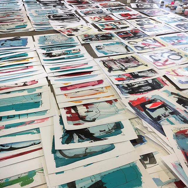
Moltzer heeft hard gewerkt aan nieuwe kunstwerken en sculpturen, die voor het eerst tijdens deze tentoonstelling onthuld zullen worden.
‘The Wonder Duo’ (Stefan en Mozes) is uitgenodigd om live muziek te verzorgen.
Wanneer: 22-24 December 2023
Waar: “Vrij Paleis”, Paleisstraat 107, 1012 ZL Amsterdam
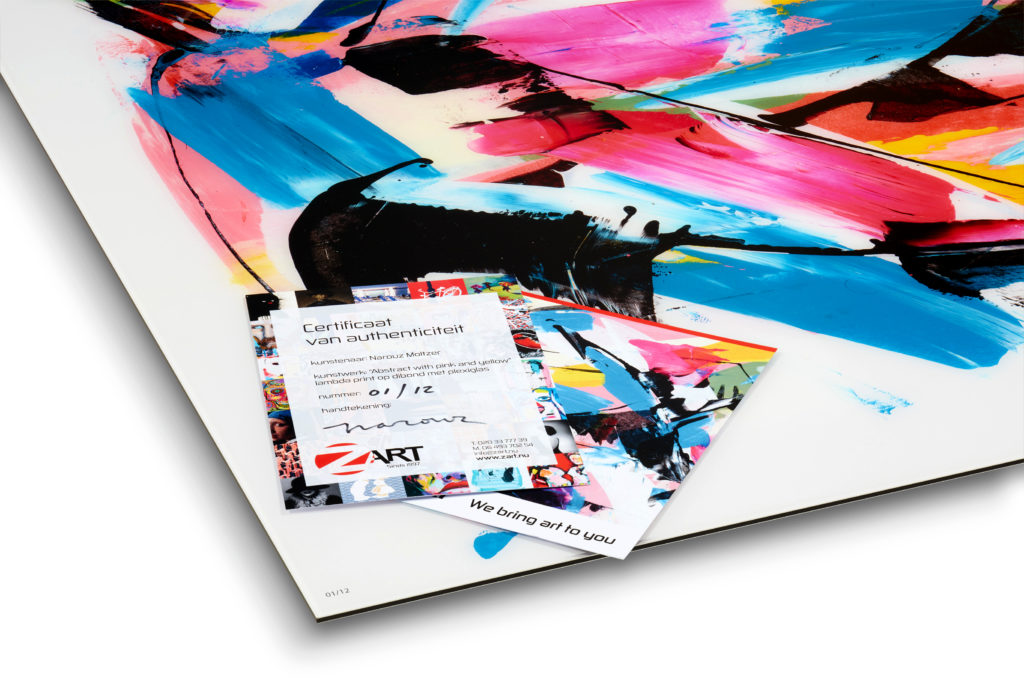
Maar wat deze expositie echt bijzonder maakt, is de hartelijke uitnodiging aan iedereen die voorbij loopt! Toegang is gratis, dus kom langs. En als je nog op zoek bent naar het perfecte kerstcadeau, heb je geluk! Er zijn betaalbare, prachtige originele kunstwerken beschikbaar die de feestdagen extra speciaal zullen maken.
De kers op de taart? Op de openingsdag, 22 december, ben je uitgenodigd om samen met Narouz een glas bubbels te heffen en te proosten op zijn verjaardag! Geen cadeaus, alsjeblieft. Koop een kunstwerk voor iemand anders, dat is het mooiste geschenk dat hij zich kan wensen.
Wanneer: Vrijdag, 22 December 2023
Tijd: 17:00 – 22:00 uur
En voor degenen die op vrijdag verhinderd zijn, maak je geen zorgen! De expositie blijft toegankelijk op zaterdag en zondag, zodat je op je gemak kunt genieten van de kunstwerken op een moment dat jou het beste uitkomt.
Dus, nodig je vrienden en familie uit, deel deze uitnodiging met andere kunstliefhebbers. Narouz kijkt ernaar uit om jullie allemaal te verwelkomen op deze drie dagen.
Tot binnenkort,